In this article, you will learn how to create a dashboard to monitor your search traffic in Data Studio. While Search Console offers out-of-the-box charts and filtering capabilities, Data Studio lets you customize your own charts and view them alongside other data, such as data from Google Ads, Analytics, YouTube, and BigQuery. If you missed the previous article in this series, you can find it here: Connecting Search Console to Data Studio.
Before we dive deeper into creating dashboards, we have good news for all Data Studio users: As of today, the Search Console connector includes data for Discover and Google News traffic, similar to the data recently added to the API.
In today’s post, we’ll show you a dashboard that you can use with your own data. This makes it easy to switch between different Search Console properties, data types, devices and more. You can associate your own data with this template to keep track of your site’s Google Search traffic.
Now let’s talk about the dashboard in more detail.
Purpose and use of a dashboard
When creating a dashboard, you should always first define its purpose. Most use cases can be assigned to one of three scenarios:
- Performance monitoring: With this you can quickly recognize a change in the data, e.g. B. by monitoring URL clicks and click-through rate (CTR) for key pages on your site.
- Exploratory data analysis: With this you gain insights from data, e.g. B. by analyzing their search performance patterns in different countries, on different devices or in different parts of the website.
- Global Information: This allows you to post interesting trends and patterns, e.g. B. by sharing aggregated data segmented by industry.
Today we’re going to discuss a performance monitoring dashboard that you can use to spot problems right away. Typically, this type of dashboard uses a simple visualization, such as line and bar charts and tables. These are understandable at a glance. Then, when a problem arises, the SEO or analyst can dig deeper into it through exploratory data analysis. We’ll go into that in the next post.
Dashboard to monitor search traffic
As already mentioned, in this post you will find a template that you can use to track performance in Google search. In this section, we’ll discuss how to import your Google Search data into Data Studio, what features and data the dashboard offers, and why we made some design choices.
Set up the Search Console connector
Sign in to Data Studio, create a Search Console data source, and select the URL Impression table. It includes data for the property parameters “web”, “image”, “video”, “news”, “discover”, and “googleNews” at the URL level. The property parameter selected here will then be the default parameter in your report, but you can also access the others via a filter. More on that later in this post. For more information on the data, see the performance reports help pages.

Control data using filters and dates
In the report header you will find several options for filtering the data in the charts:
- With data control, you can switch between the properties in Search Console that you have access to.
- Selects the time period for the report. By default, you are shown the last 28 days compared to the 28 days before.
- By creating filters, you can break down your data:
-
- Page: This allows you to include or exclude one or more pages on your website. Tip: You can use regular expressions in a similar way as in Search Console.
- Type: You have the option to choose between different data types, including Discover and Google News. You can only choose one at a time.
- Country: Allows you to include or exclude one or more countries.
- Device: Allows you to select a device category or multiple device categories.

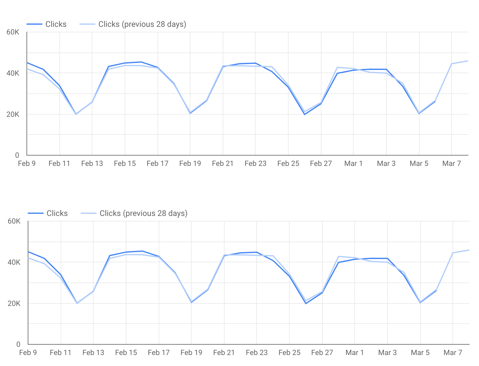
Monitor clicks and CTR over time
A line chart is the most effective way to visualize how metrics are changing over time. In this case, we considered both clicks and website CTR. In the line chart, weekends and weekdays have very different patterns (one of the reasons why it’s important to always use multiples of 7 in line chart period) – keep an eye on the days that deviate from this pattern.
Note that this chart shows data from a work-oriented website. Therefore, traffic is high on weekdays and low on weekends. Your website might look very different.